

Showing and hiding content in Adaptive Cards
Table of contents:
In Adaptive Cards there are multiple ways to show and hide content depending on other content or conditions, or even user interaction. But despite that most of them is available since the version 1.2 (so quite early) it requires a bit of knowledge how to actually implement them.
There are 3 major ways for showing and hiding content in Adaptive Cards:
- Action.ShowCard
- Action.ToggleVisibility
- Condition defined under “Only show when” property
Let’s go now through each of them.
Action.ShowCard
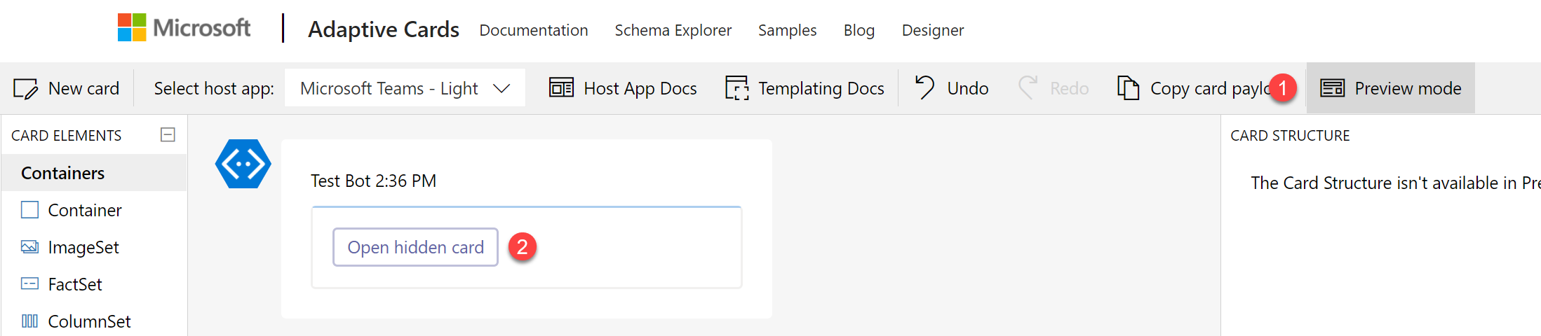
To use it first you need to add “ActionSet” element to the designer canvas and then select Action.ShowCard from the list of available options:

Once that is done, define button’s properties inside “Element properties” window, such as its title and id.
Hint! To display the other card, that will be shown after clicking on the added button, double click it! It will trigger the hidden card to appear, so you can easily author its contents.
Next double-click the button, to display the hidden card and author its contents:

Next, switch to “Preview mode” to see how the card is being shown and hidden after clicking the button:
Important! If you add “Action.Submit” to the hidden card it will send data from all fields present from that card and “up” – so from all parents of that hidden card. The “Action.Submit” button on a top-most card will only send data from that top card.
Data from cards is always submitted from parent to child cards.
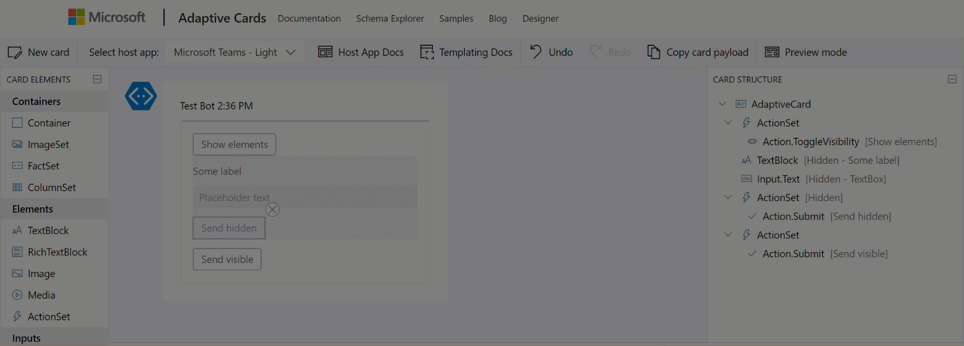
Action.ToggleVisibility
To use it first you need to add “ActionSet” element to the designer canvas and then select Action.ToggleVisibility from the list of available options:
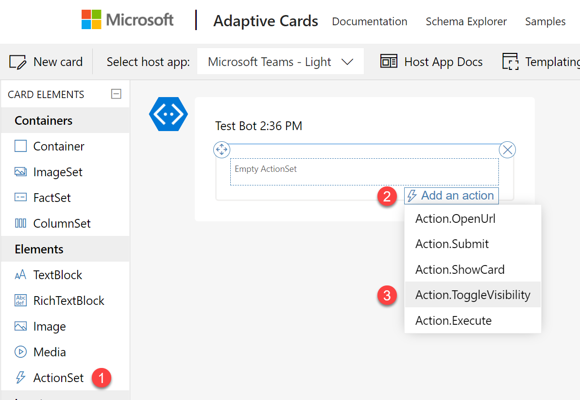
Next, the same as with ShowCard scenario, define properties of the added button.
Important! Unlike with ShowCard, the ToggleVisibility requires you to do some work directly within the generated JSON payload of the card. There is no UI to configure it any other way.
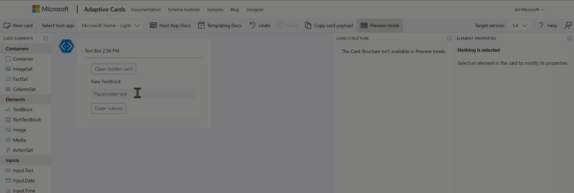
Now add elements to the card that you want to show and hide after clicking the button. Then define their properties:
- Id – it is absolutely required to define unique ids of the added elements. Ids are used to target elements and toggle their visibility.
- Initially visible – define whether elements should be visible as the card is rendered, or hidden. Toggle will then either show them, or hide them. When you unclick the checkbox, element will be overlayed with a greyed pattern.
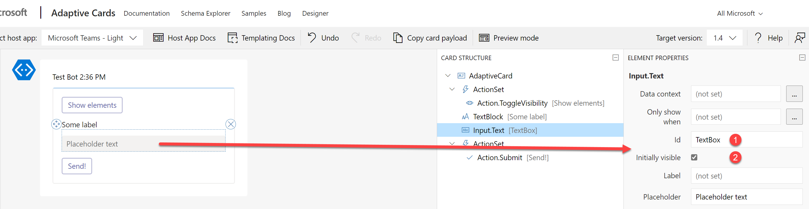
Now navigate to JSON payload and find ToggleVisibility button’s definition. Add there the following code:
"targetElements": [ "colon delimited list of elements' Ids to toggle" ]
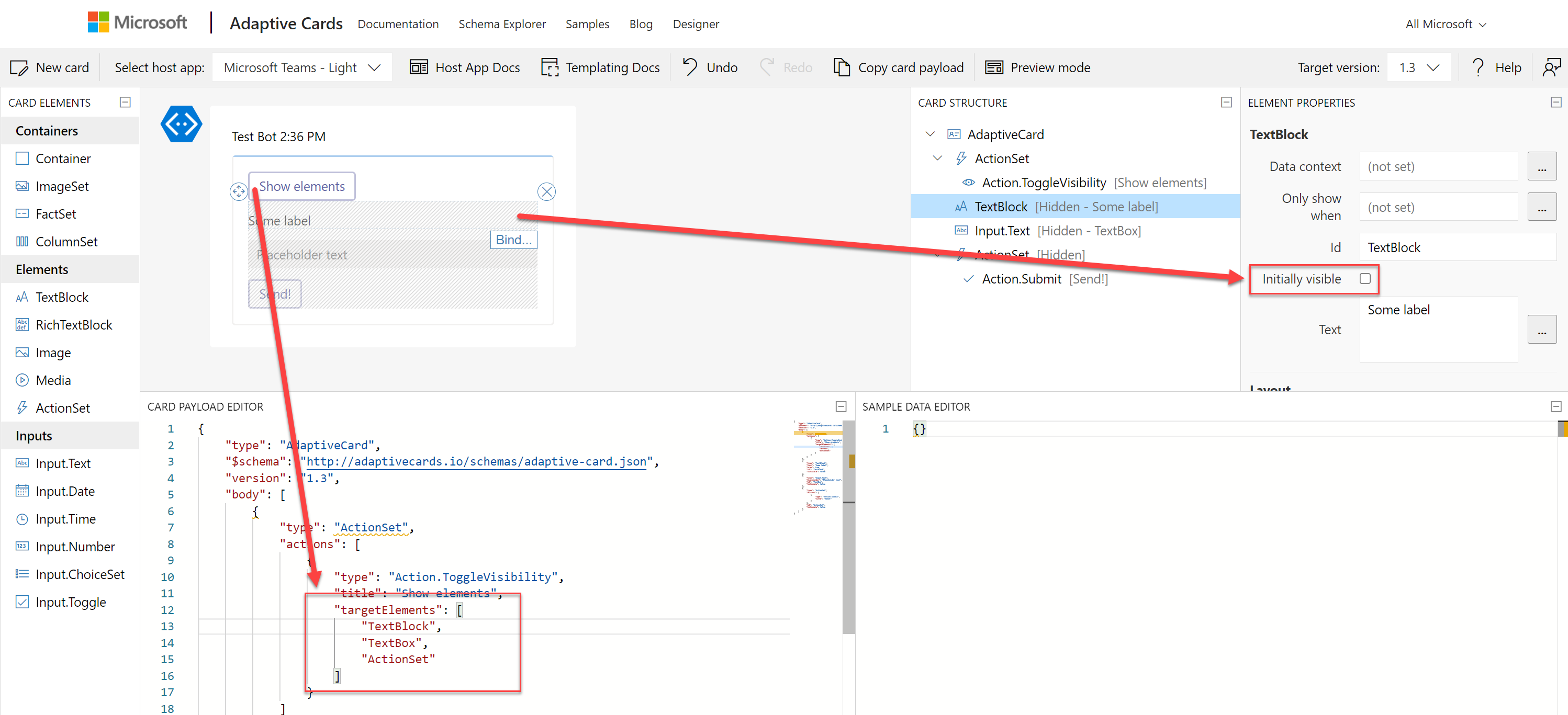
Important! The only “downside” of that approach is in case you add an always visible submit button, then it will always send data from all fields even when they are hidden.
Last step is to test it. Switch to “Preview” mode and examine behavior of your card:
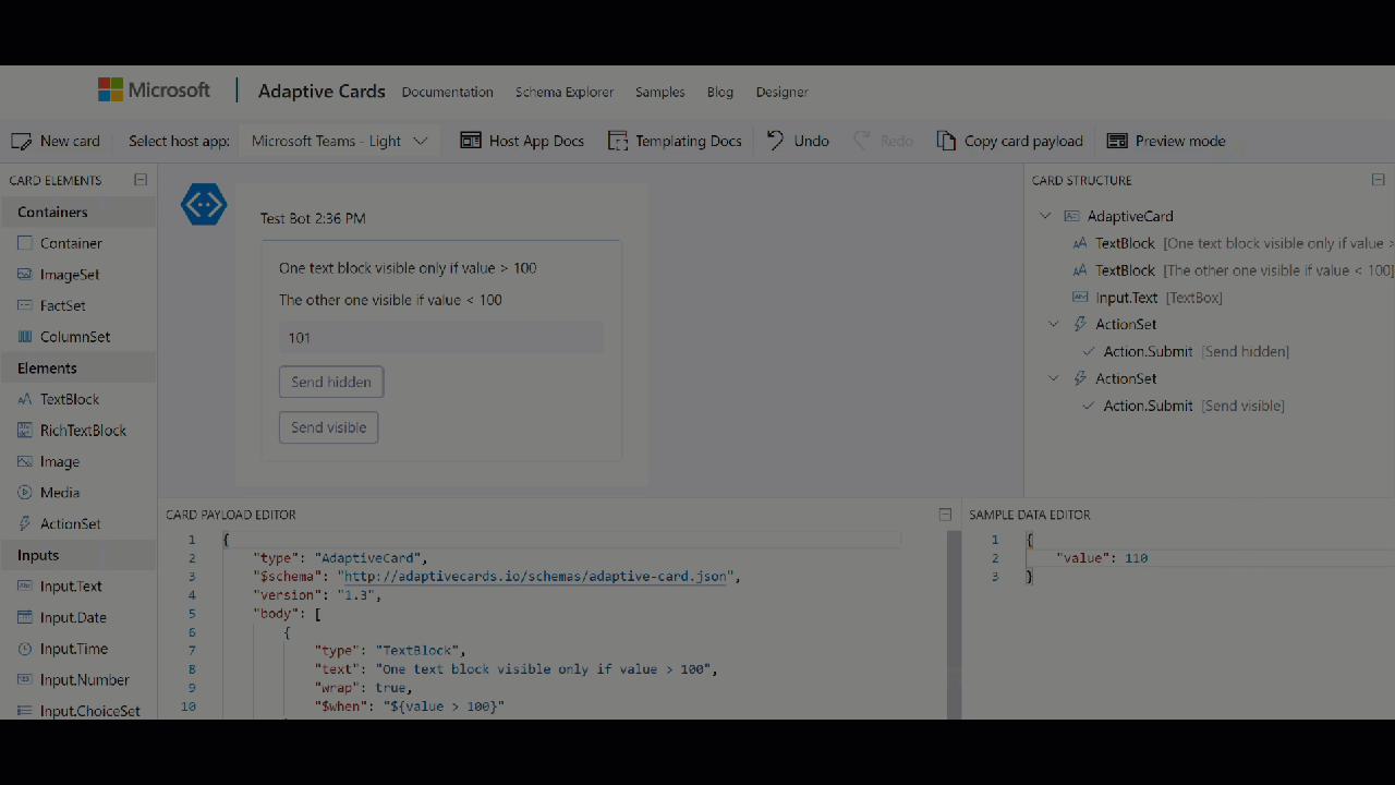
Only show when
This approach uses “Adaptive Cards Templating Language“. To be able to use it, first you need to define Data that will be bind with the card. And once you have the data, then you are able to create a condition that determines when an element should be visible:

You can use different types of comparisons, to both integer, dates, boolean or string data types.
Important! Unlike “Toggle”, showing and hiding elements based on conditions is actually happening when a card is being rendered. As of today, Data that card is using is only static, so it cannot be changed after the card is displayed. This means, that if a field is having a condition that prevents it from being displayed, even when it has a default value set, its value will not be submitted as long as the field is not visible.
Finally, enter “Preview” mode to see how your card behaves:
And that’s it! Hope you will find this tutorial useful. If you have any comments, write them down below. Thanks!


Bartosz Malinowski
This is great. I managed to replicate all steps. Is this approach applicable to Outlook actionable messages? Obviously with Action.HTTP instead of Action.Submit. I need to build UI which would allow to display records to the user and allow them to update each record in separation. Is it even possible?
Tomasz Poszytek
It would be possible, although require some creativity. Basically you could add Action.HTTP to each record, then use “Update card” functionality to replace existing one with it’s updated version, showing actions to all other records, but the one for which it was executed: https://poszytek.eu/en/microsoft-en/office-365-en/powerautomate-en/adaptive-cards-in-outlook-ultimate-guide/#Replace_existing_Adaptive_Card_with_confirmation_Adaptive_Card
Deisbel Diaz
Hi Tomasz,
I have a ChoiceSet with the value linked to a data property, let say: currentValue. The Choices values will be: Container1, Container2
Then, I have some Containers that I want to show/hide based on that value, like
“$when”: “${!empty($root.currentValue) && $root.currentValue== ‘Container1’}”
The problem is the $when is not reactive, it does not react to any value change of currentValue. It only evaluate the condition during the first render of the card.
Any trick to make the $when reactive?
Tomasz Poszytek
And where is currentValue being set?
Iain Ray
Hey Tomasz, hope its going well, cheers for your recent videos on youtube etc.
Quick question, i have an adaptive card with choice set initially hidden, its only needed to show if the card recipient wants to change some current information displayed to him in the card, clicks the edit button which hides current info and displays option set to choose new info. I want the option set to be required only if the edit button is pressed and it opened the section to edit the option set.
So conditional mandatory fields, is this possible, if so can you point me in the right direction?.
Tomasz Poszytek
Hey thanks! You can try the templating language, and the conditions, but I have a feeling, this will not work for that setting: https://learn.microsoft.com/en-us/adaptive-cards/templating/language#conditional-evaluation.
Ricardo Perez
Tomasz thanks in advance, I would like to create an AC which will be responsive when I’ve selected the first dropdown change the second dropdown, forward my code, this code means you have $data{departamento{},categoria,{},ubicacion}, before the body.
Tomasz Poszytek
Hi, sorry but cascading dropdowns is not possible in Adaptive Cards.
Rakesh
Hi Tom, is it possible to build cascading filter. We have long list for user to select but since typehead search is not available for MS team yet. Need to implement cascading. Let user select category and display associated drop-down based upon that selection? Is it possible
Tomasz Poszytek
Nope, not possible. Sorry.
Glib
Hello Tomasz,
I have a problem, I have put $data after type, and when I put $when clause in any element nothing is happening.
“type”: “AdaptiveCard”,
“$data”: {
“vipstatus”: “1”
},
“$schema”: “http://adaptivecards.io/schemas/adaptive-card.json”,
“version”: “1.4”,
“body”: [
{
“type”: “TextBlock”,
“text”: “VIP Status Test”,
“wrap”: true,
“$when”: “${vipstatus==1}”
},
{
“type”: “Input.Toggle”,
“title”: “VIP Service Updated”,
“id”: “vip”,
“$when”: “${vipstatus==2}”
}
Tomasz Poszytek
That is most probably because of the type mismatch. In $data vipstatus is set as string, while in evaluation as number. Try doing {“vipstatus”: 1} under $data.