
Nintex Responsive Forms review
Table of contents:
The new way of building forms has been announced during the Nintex annual conference, formerly called “InspireX” (now “xchange“) during the presentation “What’s planned for Nintex Forms” (you can find it at the bottom of the page here or download the PDF here and a blog post about that is here). At that moment not very much was shown, but as the time went by, more and more facts were being unveiled.
During Nintex Roadshow in Europe, that took place in spring, even more facts and a working beta was presented. Then not that much later, Euan Gamble, Nintex Forms Product Manager, invited me and some other vTEs to the Nintex Responsive Forms Advance Preview.
A week ago Nintex Responsive Forms’ general availability has been officially announced and today they finally reached European Office 365 tenants and are available in upgrade, for customers having software assurance in on-premise Nintex versions.
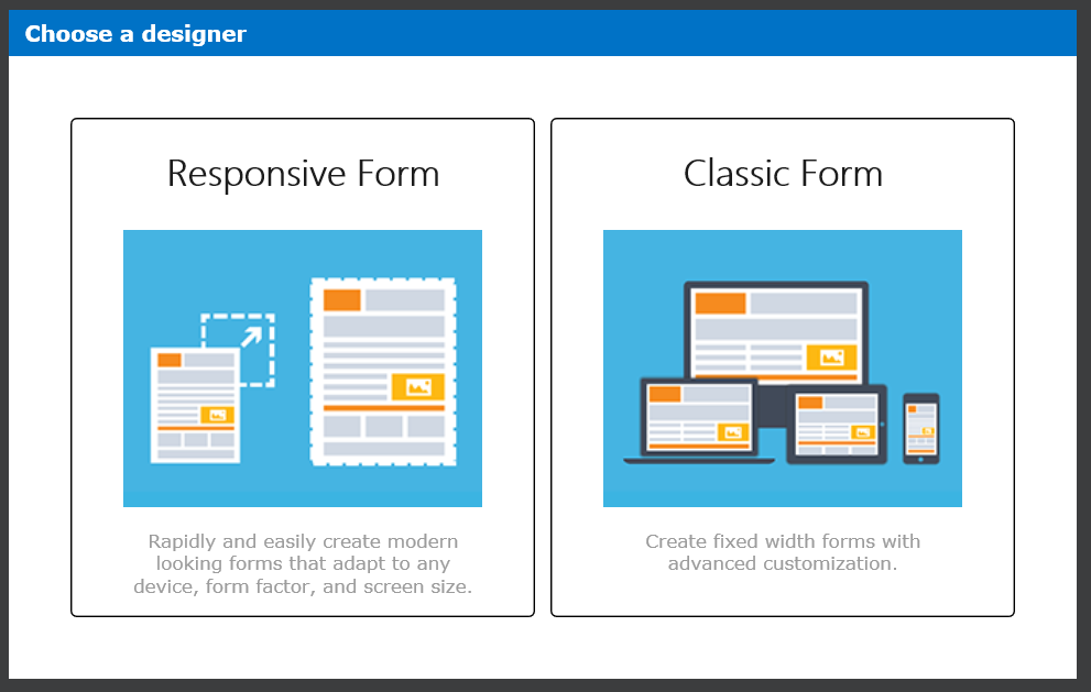
What is Nintex Responsive Forms?
They are meant to be an alternative way to “Standard Form” (also known as “Pixel Perfect form”), to set up a form in Nintex on-premise (2013 and 2016 with active SA) and Nintex for Office 365. It will also be available as the default way to create forms in Nintex Workflow Cloud.
In short words: this is an absolutely new approach in Nintex for creation of forms. It allows to super fast build a form using dynamic pane, drag&drop and snapping of controls on the layout. That way of creating forms is not new though in the world of online form editors, however very new for Nintex.

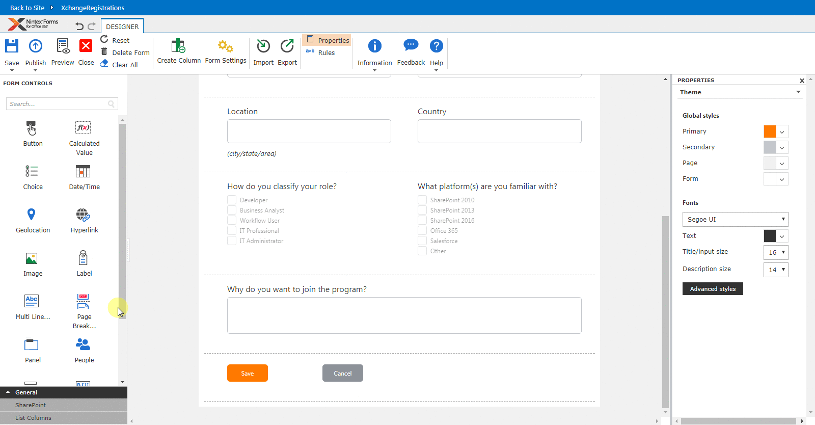
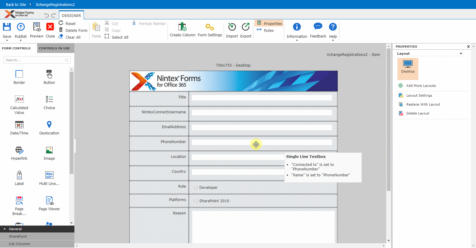
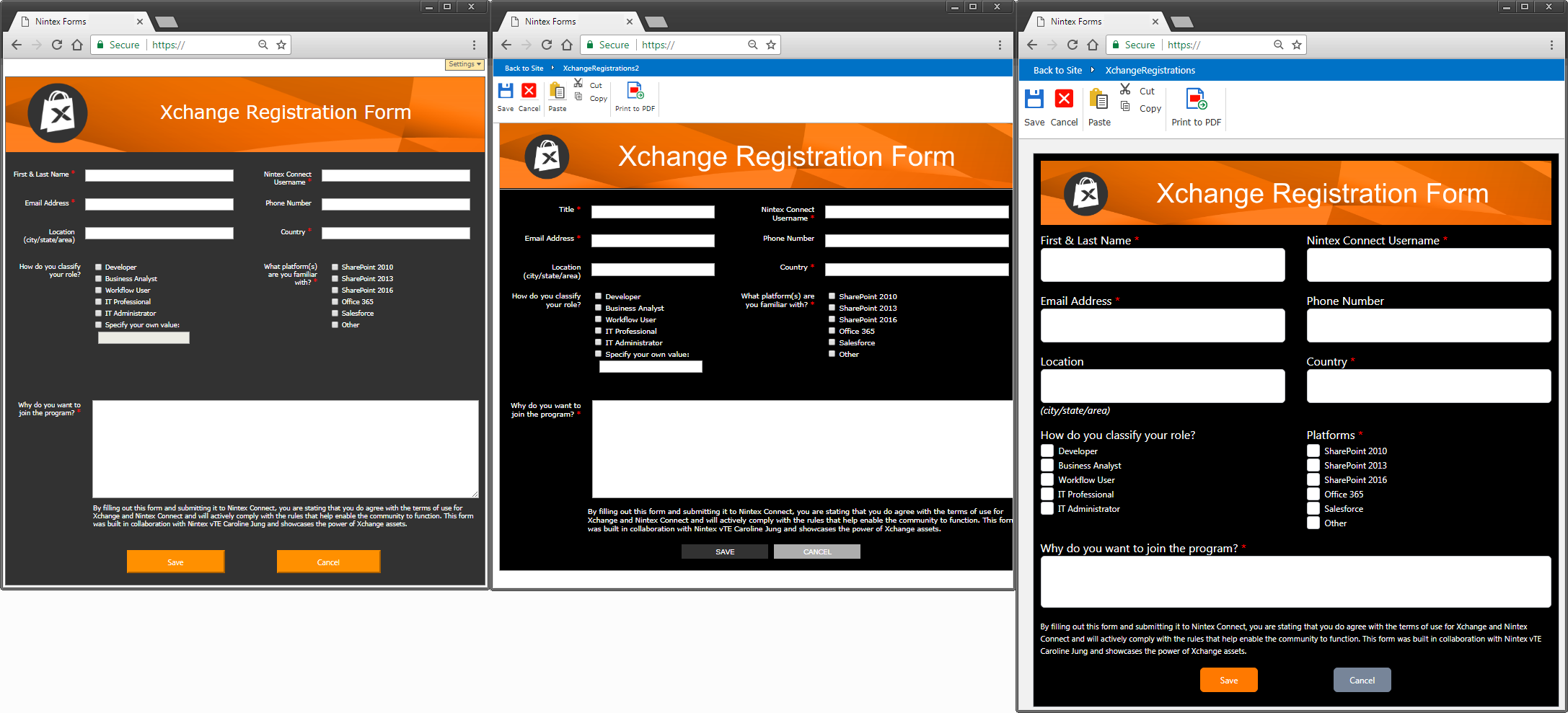
To present how the new functionality works I will try to redesign the form for Nintex Xchange registration in the next chapters.
What I do really like about this new approach is the easiness of the form creation, that together with the SharePoint modern list UI makes it really super-fast. To create the final form I just needed like 3 minutes, whereas creation of the same form using the Standard aka “Pixel Perfect” form took nearly 20 minutes. And the final effect is still far from what I expect – the more pedantic person you are, the more time you will spend realigning all the controls to look perfectly 🙂
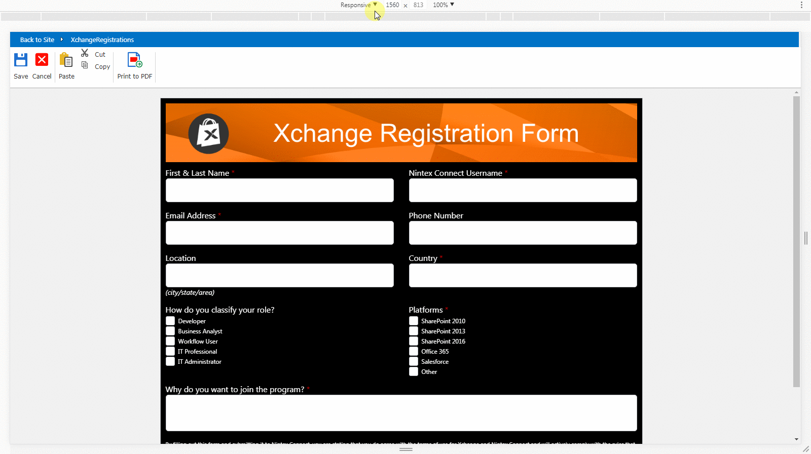
But the main and the biggest advantage of the new forms is their responsiveness to the device width – you do not need to create a separate layout per each device: desktop, tablet or mobile. You can create one and it will automatically adjust its UI to the available width:
What features does it currently support?
According to the last updates from Euan, that he provided in the Advance Preview forum, Responsive Forms currently support the following controls and features:
- Controls
- Button
- Calculated value
- Choice
- Date/Time
- Geolocation
- Hyperlink
- Image
- Label
- Multi-line
- People
- Rich Text
- Single line
- Yes/No
- List Lookup
- Attachments
- Repeater Control
- Panel Control
- SQL Request (on-premises only)
- Web Request (on-premises only)
- Features
- Responsive layout
- Print to PDF
- Change content type (on-premises only)
- Undo/Redo
- Import/Export
- Basic theme formatting
- Preview (there will also be a Device Preview in the nearest future)
- Nintex Mobile / App Studio support
- Updated Rules panel
- Select/Deselect all rules
- Delete multiple rules
- Drag/drop reorder rules
- Update and simplified rules editor
- Drag&Drop of controls
- Snap the controls to the layout
- 1, 2, 3 or 4 controls in a row
- Flexible controls alignment, padding and resize
- Dynamic layout resizing
What features will it not support?
There is a set of features existing in the Standard Form, that will not (maybe some will be implemented in the future, who knows!) be present and available for the Responsive Forms. These are:
- List View (On-premises only)
- List item (On-premises only)
- External data column (On-premises only)
- Workflow diagram (On-premises only)
- Publish as a Live form (on-premises only)
- Border
- Custom JavaScript
- Custom CSS
- Device layouts
- Controls in use panel
- Copy/paste control
- Import a Classic Form as Responsive and other way round
- Change from Classic to Responsive mode once a choice is made
- Layers
A small remark regarding custom CSS and JavaScript – features that in my opinion are the biggest advantage of the Standard Form that gives a real “no limits” for the designers. Euan wrote, that “our intent is to provide the controls and capabilities customers typically reverted to JavaScript for such as UI constructs, setting default values and additional validation of the product. JavaScript functionality will remain available in the ‘Pixel Perfect’ forms” what means, that those feature will really never be available, however the most common use-cases in which they were used, should be delivered as the configuration options.
When to use what?
(( (from left: original form, “Standard” form and “Responsive” form)
My understanding and the way I find both types of forms, is that the new, Responsive Form is a perfect solution when you want to create a quite simple, linear form, possibly filled up with rules, but still having a straight layout, possibly with intention to use it mainly via mobile channels. On the other hand the Standard Form is a really powerful tool for creating advanced forms with lots of rules and complex designs, dedicated rather for desktop “consumption”.
What do you think? How do you like new forms? Leave your comments below 🙂


Aroh Shukla
Amazingly written and detailed. Just loved it.
Tomasz Poszytek
Thanks Aroh!
Sanjay Janerkar
Hi,
I want to ask, that if we are not able to use custom CSS and JavaScript in responsive nintex forms, so is there any other options to do it except classis/ standard nintex forms
Tomasz Poszytek
Hi! No, this is impossible due to need of having a control over the layout of the form. Allowing users to inject custom css/js would have an impact on the rwd forms behavior and possibly cause many emails to support, reading “my form is not displaying properly…” 🙂
So apart from classic forms, no other way.
Sanjay Janerkar
Ok. It means better to go with classic forms 🙂. Thanks for guiding.
Tomasz Poszytek
I’d say it depends, whether you want to create a complex or easy form. For complex, when you need to go outside the box with functionalities use standard. For light, easy forms take responsive/ universal.
NEERAJ BAIMBI
Hi Tomasz,
I found that “Print to PDF” functionality is not available on Nintex Responsive form but classic forms. Is there any special configuration needed to enable. I am using Office 365 and Nintex but couldn’t locate it.
Thanks,
Neeraj Baimbi
Tomasz Poszytek
It is for sure possible. Check your form’s configuration settings. You should find the option to turn on this feature.